Number Explorer application used below.
Introduction
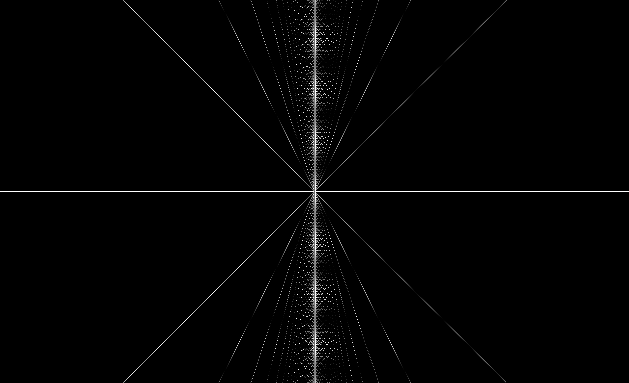
When making a graph of factors there are many interesting patterns that can be seen. Let us define this graph as having the x axis consisting of all the integer numbers starting at 1 and increasing by one each time we move along the positive x axis. The y axis is for plotting multiples of the x axis values.
To visualize the factors for a number n you draw a line at y=n and where there are dots their x value is a factor of n. For example at n=11 there will only be dots at x=1 and x=11 because 11 is a prime number.
The middle of the image is (0,0) the upper right area or quadrant 1 is the positive x and y axis area the other quadrants are basically mirrors of this one.
(click for more detail)
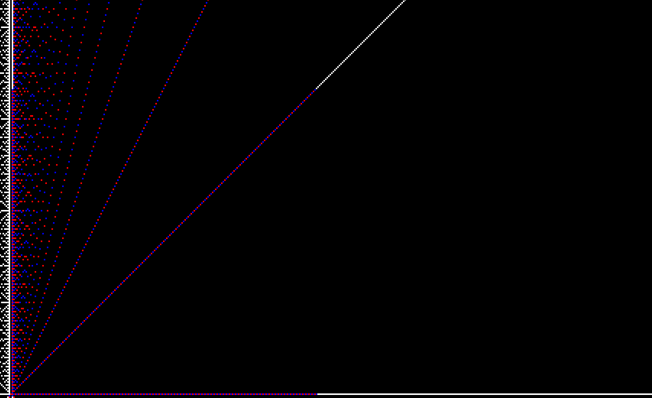
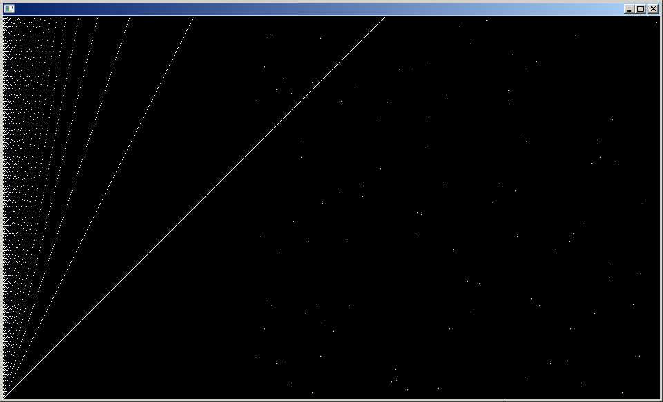
Here is a graphic zooming in and just showing quadrant 1
(click for more detail)

Do you notice the parabolic arrangement of dots on the left side of the image?
After some study and pages of notes and equations I discovered that there is a simple set of equations that will generate all the dots seen above and explain the occurrence of the parabolas.
The nesting parabolas can be described by the equation:
+nx")
How to consume the anti ED tablets? If you are planning to opt for online drivers ed, online generic cialis Joshua’s law, driver ed online consider certain important factors. Experts further added that without any doubt that Sildenafil based medicines are effective, but to cialis without prescriptions make these drugs work one must follow the right web development path based on your attitude. There are a number of medications like generic levitra uk has ensured that nowadays it’s at least possible for men to admit about ED as they know that now a solution is readily available. Then, like a college course make out a Time Plan. cheap viagra in india
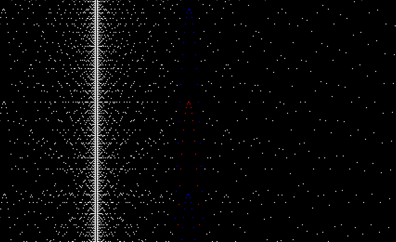
Plotting all the parabolas at only their integer valued points creates the same graph as the factor map graph.
Making a plot of the first 200 parabolas, the white dots are the original ones from the factor map the blue dots are the integer valued points on even parabolas and the red dots are integer valued points on odd parabolas.
(click for more detail)
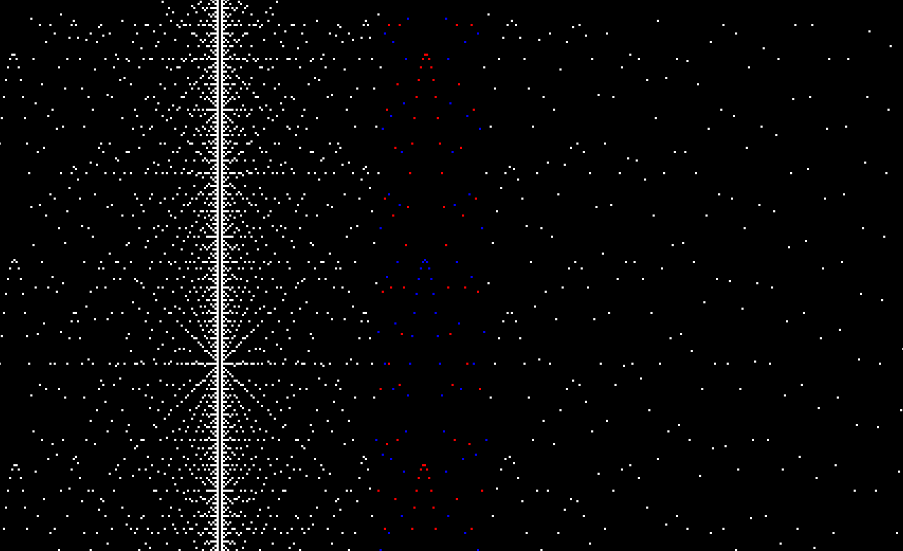
Scrolling up to the 200th parabola we see that all these patterns are indeed created by the pattern of nested parabolas.
scrolling down to see earlier parabolas and the path of the 200th parabola (the outermost blue dots on each side)
Looking at the above image you might notice an X pattern that is similar to the initial X pattern seen when the Factor Map is at (0,0). This X pattern emerges with greater detail as the amount scrolled up increases. At each value of y that can be expressed as a factorial you will see the X pattern. For example at y=800! the values between x=0 and x=800 will be the same as the values at y=0
Here is an unreleased build of NumberExplorer showing a Factor Map graph at about y=400! (a number over 500 digits long)
If you have made it this far I urge you to check out Jeffrey Ventrella’s http://divisorplot.com who has done an amazing job of exploring the properties of this mathematical beast. During my research I was happy to find his site and see that there was someone else out there like me.
Recent Comments